


9 July, 2026
You built the website. You’re getting some visitors. But the phone isn’t ringing and the contact form is silent.
If this sounds familiar, you’re not alone. This is one of the most common frustrations we hear from business owners across Gujarat — from Surat to Ahmedabad to Vadodara. And here’s the honest truth most people don’t want to hear:
More traffic is not the answer.
If your website is getting visitors but no enquiries, you don’t have a traffic problem. You have a conversion problem. And in most cases, that conversion problem is rooted in poor user experience (UX).
This blog will walk you through exactly why it happens and what you can do about it.
What Is a Conversion Problem?
Before we dive in, let’s make sure we’re looking at the right thing.
Open your Google Analytics or Search Console. Are people landing on your website? If yes — and enquiries still aren’t coming — the problem is not visibility. The problem is what happens after someone arrives.
A website that gets traffic but doesn’t convert visitors into enquiries is doing only half its job. The other half — guiding visitors toward taking action — is where most Indian business websites silently fail.
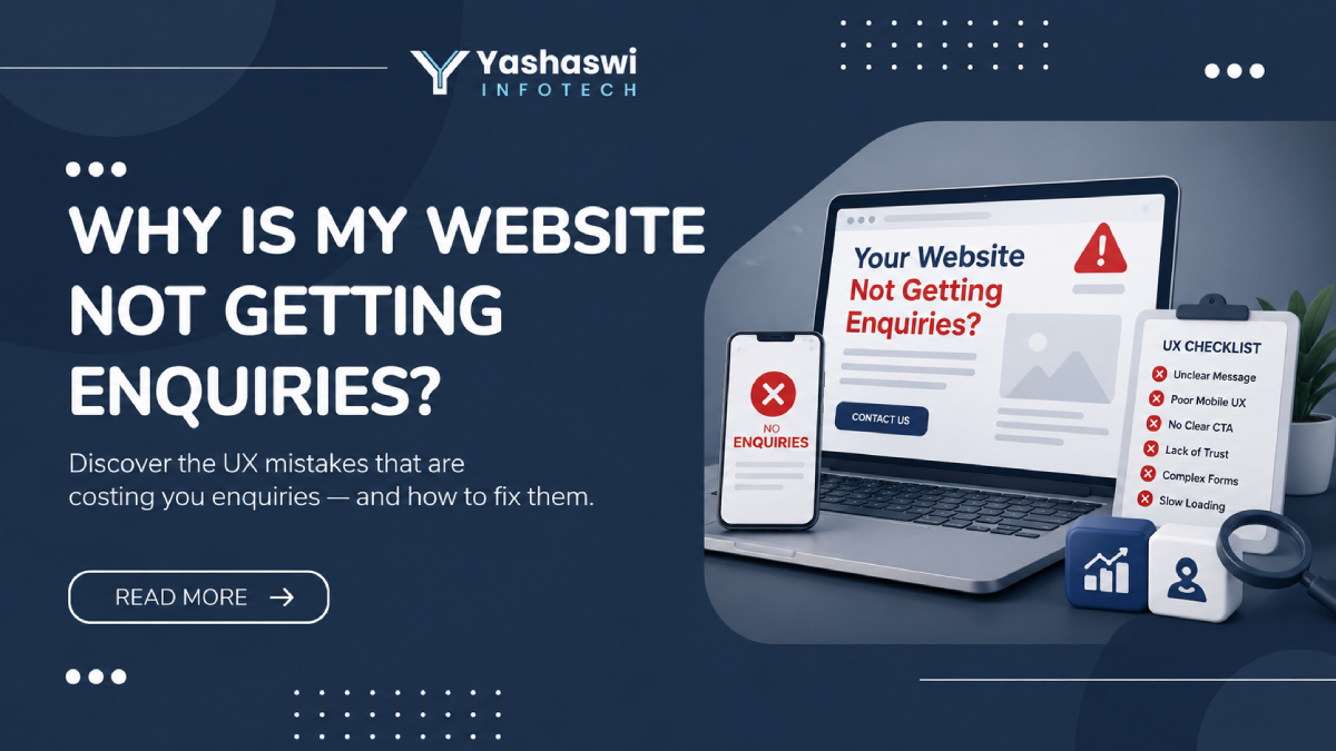
6 UX Reasons Your Website Is Not Getting Enquiries
1. Visitors Don’t Understand What You Do Within 5 Seconds
When someone lands on your website, they make a subconscious decision within the first few seconds: Is this relevant to me?
If your homepage headline is vague — something like “Welcome to XYZ Solutions” or “We provide quality services” — visitors can’t immediately tell whether you solve their problem. So they leave.
What to fix: Your homepage headline should clearly state what you do, who you do it for, and what outcome you deliver. Not clever. Not creative. Clear.
Bad example: “Innovative Solutions for a Digital World” Good example: “Website and App Design for Gujarat Businesses That Want More Enquiries”
2. Your Mobile Experience Is Broken
In India, more than 70% of web traffic comes from mobile devices. Yet most business websites in Gujarat are designed for desktop first — and the mobile version is an afterthought.
A visitor browsing on their phone who encounters tiny text, buttons that are hard to tap, or a layout that breaks on a small screen will leave immediately. They won’t come back.
What to fix: Test your website on your own phone right now. Navigate through the key pages as if you’re a new visitor. Note every point of friction. If the experience feels clunky, your mobile UX needs attention before anything else.
3. There Are No Clear Calls to Action
Many websites describe services well but never clearly tell the visitor what to do next. There’s no obvious “Call Us,” “Get a Quote,” or “Book a Free Consultation” button visible at the right moment.
Even when a CTA exists, it’s often buried at the bottom of the page — after the visitor has already decided to leave.
What to fix: Every key page on your website should have at least one clear CTA visible without scrolling. The language should be specific and low-friction — “Get a Free Consultation” works far better than “Contact Us,” because it tells the visitor exactly what they’ll get.
4. Your Website Doesn’t Build Trust
Would you hand your phone number or business details to a stranger on the street? Probably not. Your website visitors feel the same way.
If your website has no client reviews, no case studies, no real team photos, no recognisable credentials, and no proof that you’ve done this before — serious buyers will hesitate. They’ll go back to Google and find someone who feels more established.
What to fix: Add trust signals to every key page:
- Google reviews or testimonials with real names
- Case studies with specific outcomes
- A photo of your team (not stock images)
- Your physical address and a local phone number
- Any awards, certifications, or partnerships
5. Your Contact Form Has Too Many Fields
Every field you add to a contact form reduces the number of people who complete it. This is not an opinion — it’s well-documented user behaviour.
A form asking for Name, Phone Number, Email, Company Name, Budget Range, Project Description, and Preferred Contact Time will convert far fewer visitors than one asking for Name, Phone Number, and “What do you need help with?”
What to fix: Reduce your contact form to 3–4 fields maximum. Tell visitors what happens after they submit — “We’ll call you within 24 hours” removes the anxiety of not knowing what comes next.
6. Your Page Load Speed Is Killing Enquiries
Indian internet users — especially on mobile — are increasingly impatient with slow websites. Research shows that even a 1–2 second delay in load time significantly increases the chance of a visitor leaving before the page finishes loading.
A slow website doesn’t just hurt conversions. It also signals to Google that the user experience is poor, which can affect your search rankings.
What to fix: Test your website speed at Google PageSpeed Insights — it’s free. If your mobile score is below 60, speed is almost certainly contributing to your low enquiry rate. Common fixes include compressing images, removing unnecessary plugins, and using a faster hosting provider.
The Underlying Problem: Poor UX
Notice what all six issues above have in common? They’re all user experience problems.
UX is not just about how your website looks. It’s about how your website works — how easy it is for a visitor to understand your offer, trust your business, and take the next step.
When UX is poor, visitors leave. When UX is good, visitors stay, explore, and enquire.
This is why two websites in the same industry, targeting the same keywords, with similar traffic can produce wildly different enquiry volumes. The one with better UX wins — consistently.
What Should You Do Next?
If you recognise your website in the problems described above, the good news is that most of these issues are fixable without starting from scratch.
Start with this quick audit:
- Read your homepage headline out loud. Does it instantly tell a stranger what you do and who you help?
- Open your website on your phone. Does every page load quickly and feel easy to use?
- Count your CTAs. Is there at least one visible CTA on every key page?
- Look at your contact form. How many fields does it have?
- Search for your business name on Google. What reviews and proof points appear?
If any of these reveal a problem, that’s your starting point.
For businesses in Gujarat that want a professional review of their website’s user experience, our UI UX design services in Gujarat are specifically built to diagnose and fix these issues — from navigation structure to mobile experience to conversion flow.
You can also learn more about how we build websites that are designed to convert from day one, not just look good.
Frequently Asked Questions
My website looks good. Why is it still not getting enquiries?
A good-looking website and a high-converting website are not the same thing. Most websites that fail to generate enquiries have clear, professional design — but poor user experience underneath. The problem is usually in the structure: unclear messaging, weak CTAs, lack of trust signals, or a broken mobile experience. Design is only the surface layer. UX is what drives enquiries.
How many enquiries should a website be generating?
Will getting more traffic fix my enquiry problem?
Not if the problem is UX. Sending more visitors to a website that doesn’t convert simply makes the leak more expensive. Fix the conversion issues first — then scale traffic. More traffic into a well-converting website produces dramatically better results than more traffic into a broken one.
How long does it take to fix UX issues on a website?
It depends on the scope of the problems. Some fixes — like rewriting a headline, simplifying a contact form, or adding a CTA — can be done in a day and show results quickly. Structural fixes like improving navigation, redesigning key pages, or improving mobile experience take longer, typically 2 to 6 weeks depending on the size of the website.
Should I redesign my entire website to fix enquiry issues?
Not necessarily. In most cases, a full redesign isn’t required. Targeted improvements to the pages that already get the most traffic — homepage, service pages, contact page — usually deliver the biggest improvement in enquiry volume. A UX audit is a good starting point before deciding whether a full redesign is needed. Learn more about our UX audit and redesign service.
Conclusion
If your website is getting visitors but no enquiries, resist the urge to spend more on ads or chase more traffic. Instead, look at what’s happening after people land on your site.
Is the message clear? Is the mobile experience smooth? Are there visible CTAs? Is there enough trust? Is the contact form simple?
Fix those, and enquiries will follow.
At Yashaswi Infotech, we help businesses across Gujarat identify exactly where their website is losing potential customers — and fix it. If you’d like a fresh set of eyes on your website, get a free consultation and we’ll tell you honestly what’s holding it back.